Sourcing historical returns
Carbon Collective (simulated)
Carbon Collective’s climate friendly portfolio hasn’t existed until now, so the only way for us to evaluate its financial performance is to run a simulation.
In our case, we asked ourselves, “what if we had launched the Carbon Collective investment strategy, not today, but on the eve of 2015?”
Before diving in, let’s go through a quick overview of how we build our stock portfolios.
The stock market is constructed of 11 sectors (technology, utilities, real estate, etc.) At a high level, our portfolios directly invest in index funds that track the seven low-carbon sectors of the stock market (~80% of the market in 2020). They give the allocation that was going to the high carbon sectors (~20%) to our collection of companies building climate solutions. Our goal is to use market sectors to track the market like an index fund, but replace the high carbon sectors with the companies building climate solutions.
Ok, back to the math. From here on it’s pretty technical.
We begin the simulation with data pulled from 12/31/14 and update the sector allocations annually on the last day of each year through 12/31/19. This better simulates how this strategy would have actually performed by incorporating the historical market capitalization of each sector and rebalancing the portfolio’s stock allocations annually based upon it. For example, on 12/31/14, the stocks representing the energy sector made up 8.45% of the total value of the stock market. By 12/31/19, where we simulated the last annual rebalance, energy stocks represented only 4.35% of the total stock market.
Things got a little more complicated for the individual stocks. Unlike the seven low-carbon sectors which we represent with individual sector ETFs, the remaining four sectors are populated with stocks from the individual companies building climate solutions. Here’s an example of how we calculated the allocations for an individual stock in our Drawdown Index:
- On 12/31/14, the utility sector represented 3.25% of the total stock market.
- Our stock collection includes seven utility stocks.
- The total market capitalization of these stocks combined on 12/31/14 was $92.81B.
- The largest of them, Nextera Energy, had a market capitalization of $47.1 billion on 12/31/14, representing 50.7% of the total market capitalization of all seven utility stocks.
- Therefore, it was allocated 50.7% of the 3.25% allocated for the utility sector (granting it 1.65% of the total holdings on 12/31/14).
- One year later, on 12/31/15, the utility sector had shrunk to represent 2.99% of the total market. Nextera’s market cap had risen slightly to $48.7B, so in rebalancing the portfolio, Nextera ended up representing 1.54% of the total portfolio holdings on 12/31/15. Etc.
Question – Why didn’t we simulate further back to say, 10 years?
Answer – Too few of the companies in our Drawdown Index had yet entered the stock market 10 years ago, so we found simulating further back deviated too far from our strategy.
Further notes (if you want to double-check our math):
- Management fees. Carbon Collective’s stock collection returns include the management fee a member would pay for an account of $10,000 ($25/year + 0.20% = 0.45%). Neither Vanguard index portfolio has any management fees included, although Betterment’s total returns do include their management fee.
- Consumer staples. There is a small deviation in this model from the full Carbon Collective Investment strategy, regarding consumer staples. There are five companies we cut from the consumer staples index, two meat companies and three tobacco companies. As we could not access data for the historical holdings of the consumer staples sector ETF, we could not accurately simulate the act of cutting these companies from the simulation. As these companies represent a relatively small part of the total portfolio (0.20% at the highest), we opted to directly track the consumer staples index with the ETF: FSTA for this simulation.
- Market Sectors. S&P, the company who builds the S&P 500, also manages the Global Industry Classification Standards or GICS. They publish these categories to break the stocks on the S&P 500 into the 11 market sectors. As the market has shifted overtime, S&P has updated the GICS to reflect market changes. Some notable updates for our simulation were the addition of the real estate sector in 2015 and the transition of the telecommunications sector to the broader communications sector in 2018. The weightings in our simulations are based upon this dataset from 2015 – 2019 and this dataset for 2014. If you run these numbers yourself, you will find that for a few of the years they do not add up to exactly 100% and can be off by +/- 0.10%. To correct this, we added or subtracted 0.10% from the largest sector, technology, in those years. We made no other changes to the sector weightings for this simulation.
Overall, while this exercise represents our best attempt at honestly simulating “what would have happened” if we had launched this strategy on 12/31/14, it is far from comprehensive. We sought to err on the conservative side, only rebalancing the portfolios annually with the new market sector weightings. In reality, our portfolios rebalance more often than that, using a trigger to buy or sell holdings in a given sector should it grow or shrink by more than 25% of its initial weightings within the year. Such rebalancing tends to perform better over time (at least historically). Historical results are no guarantee of future returns.
Betterment (from their website)
Betterment provides a calculator that allows you to see how their standard portfolios performed over a given time period. At the time we sourced this data, Betterment provided their historical data through June 30th, 2020, so we used this as the final date for all of the portfolios in this calculator and looked at the time period stretching back five, three, and one year from it. All data we provide in our comparison was directly copied from Betterment’s calculator.
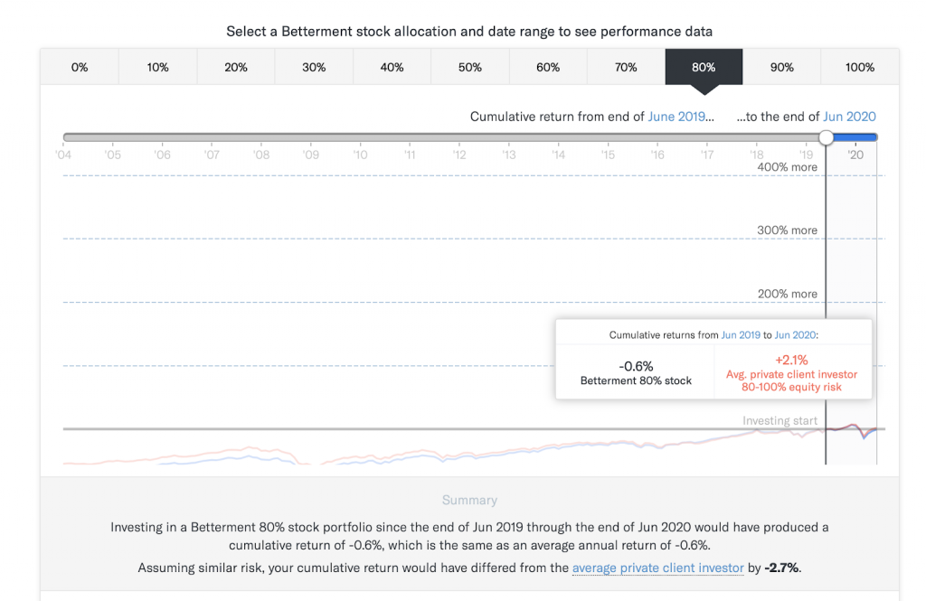
Question: why are Betterment’s returns so much lower than Carbon Collective’s or either of the Vanguard Index portfolios?
Answer: We cannot be fully sure. Betterment has not published their fund allocations, so what follows is speculation. The most likely culprit is that many robo-investors like Betterment hold a high percentage of their equities in international funds. Over the past five years the international stock market has not performed as well as the US stock market.
We do not include international funds in our portfolio because we could not find one that did not include fossil fuel companies and met our financial criteria for investment. Are international equities necessary in a diversified portfolio? Our answer (and Jack Bogle’s – Vanguard’s founder) is no international equities are not necessary in a balanced portfolio.
Vanguard index portfolios (custom calculation)
On the calculator showing historical returns on the product page, one of the categories is Vanguard Index Portfolio US Only. These represent three simple portfolios built with Vanguard’s broad market ETFs.
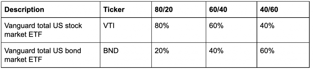
These portfolios do not include any international holdings, making them a better “apples to apples” comparison with Carbon Collective’s portfolios. It’s for this reason that we decided to include them on the main page calculator. They are still not a perfect comparison as Carbon Collective’s portfolios do have some international bonds through the two green bond funds.
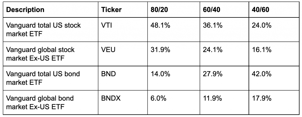
For further context, we also compared Carbon Collective’s portfolios to a series of Vanguard index portfolios that did include international holdings. While we derived the allocations for these from a 3rd party source, they closely align to the same stock, bond split:
Results: Returns and financial stats
We pulled results from the simulation from three sets of time periods:
- 5 years: 06/30/15 – 06/30/20
- 3 years: 06/30/17 – 06/30/20
- 1 year: 06/30/19 – 06/30/20
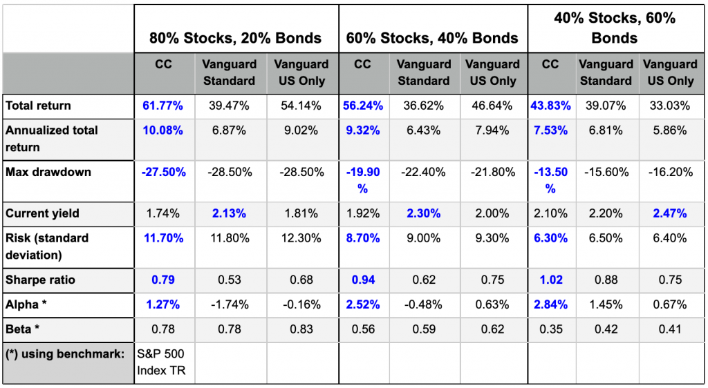
The financial statistics below are from the “5 year” time period spanning 06/30/15 – 06/30/20:
Financial jargon --> plain english translator
- Total return = how much a given portfolio increased or decreased in value. This includes capital appreciation (price of the stock increasing) and dividends from the stock (which for this model are assumed to be reinvested).
- Annualized total return = the total return from each portfolio returned per year over this time period.
- Max drawdown = the largest loss for the portfolio over this time period.
- Current yield = how much you could expect to make in dividends and interest from this portfolio per year.
- Risk (standard deviation) = how much volatility you could expect from this portfolio. One standard deviation = 68% of the time, two = 95% of the time. So according to this model, we would expect the 80/20 Carbon Collective portfolio to not drop by more than 11.7% 68% of the time and not by more than 23.4% 95% of the time. Generally the lower this number, the better. Always take this with a grain of salt – these are based on historical data which is no guarantee of future returns.
- Sharpe ratio = This is a little bit harder to grock. It indicates how well a portfolio did given its risk. The higher the number, the better.
- Alpha = How well did it perform over a given benchmark (often the S&P 500). Generally the higher the number, the better.
- Beta = How volatile is it compared to a benchmark (often the S&P 500). 1.0 = just as volatile as the benchmark.
Full financial analysis comparing all portfolios
If you would like some further reading into the high-level allocations, comparison of risk and returns, and a breakdown of each holdings performance, check out the series full PDF below:
80% Stocks / 20% Bonds
60% Stocks / 40% Bonds
40% Stocks / 60% Bonds